
Introduction
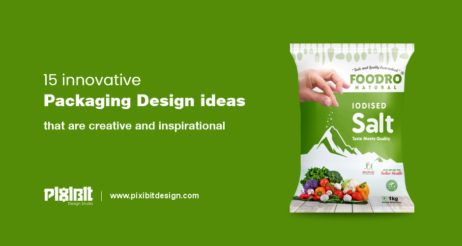
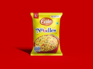
Innovative packaging design are in high demand. Packaging, when done correctly and creatively, is ultimately what sells your product. It’s not just about putting your logo on a package or creating a cool label or sticker. It grabs attention, conveys information, and makes consumers feel a certain way. It is not uncommon to associate the term “packaging” with the protection of the product.
But today, packaging design comes in many forms. While many take the functional route to ensure product safety, others use packaging to entertain and help brands stand out in the eyes of customers.
From crisp, understated colors to whimsical details that lift the mood, today’s customer-favorite designs show the importance of creative packaging. That’s why good packaging design is important, and there’s a range of packaging ideas to keep your creativity going!

15 Innovative Packaging Design ideas to be excited about:
Whether it’s to retain customers or win new fans, these 15 innovative packaging ideas will help create a memorable unboxing experience:
1. The bright, organic silhouette
Organic has been around for a while, but this time they have been updated with softer, curved edges — think specks, waves, and circles — and a laid-back aesthetic, like color beyond the lines.
2. Minimalist design
In this chaotic new world where so much is happening every day, sometimes all we need is a reprieve. It’s no surprise, then that brands are opting for softer, muted tones and clean lines in their packaging design, as they inspire soothing, uplifting moments in customers.
Some of these creative packaging examples opt for muted colors instead of brighter neons. Others limit themselves to no more than 2 colors in a pack so as not to stimulate the eyes too much. Some people use smooth, flowing lines in their illustrations instead of jagged edges to convey calm and softness.
3. Color gradients
This trend calls back to the Y2K nostalgia we’ve seen in the last couple of years. But forget the holographic and chrome. Instead think of softer color combinations like pink, blues, and purple. The effects are eye-catching blended color combinations that have a fluid look and feel.
4. Textured Packaging
As accessibility becomes more of a part of the design process, it makes sense that we’re seeing an increase in the use of textures in packaging materials. Think embossed details, cutouts, and adding extra material to an otherwise smooth packaging surface.
5. Bottles Made From Recycled Fishing Nets
Did you know that up to 1 million tonnes of ghost, nets enter our oceans each year? With so many materials at our disposal, it makes sense to try to innovate with materials. Danish company Rema 1000 has teamed up with green plastic maker Plastix to create dark green packaging for its dishwasher bottles from recycled fishing nets. Plastix collects and recycles plastic from the fishing industry. They transform fibers from fishing nets, trawls, and ropes into high-quality green plastic raw materials that can be used in new products.
6. Turn it into something else
Just because your product is one thing doesn’t mean it can’t look like something else, be creative with how your product looks. Instead of regular old tea bags, this brand of tea turns the bags into “tea shirts” with hangers. The hanger keeps the bag upright on the edge of the mug, making it functional rather than just beautiful.
7. Be playful
If you get the chance to play with your packaging, grab it. This packaging is very fun, yet simple. The illustrations interact with the product while letting it shine. Color is associated with berries, and the actions of characters eating berries indicate their quality. Have fun with bright and cheerful colors.
8. Break the mold
If you have a product that a lot of other people are also making, try to be creative in how you present it. Unlike typical glass or plastic jars, this honey packet is a beeswax container. Even better, when you’ve used all the product, you can flip the container over to reveal the bottom wick. Then you burn the packaging, leaving it completely waste-free.
9. Consider the process
If you think your product deserves a giveaway, present it as such. This limoncello was intended as a gift and was packaged accordingly. The white paper protects the glass bottle inside the long tube. When you open the cylinder, you can tear the paper from the bottle, which is reminiscent of opening an ordinary wrapped gift.
10. Use stylization
Don’t feel obligated to make your illustrations or graphics completely photorealistic. If you can stylize your images and use them as texture elements do so. This pack uses simple head and hair illustrations. The hair passes through the box and creates a pattern in the background. At first glance, you have no idea what the template is, but as you explore the package, you’ll realize it’s been his all along.
11. Tell a story
If you can tell a story with your packaging, you’re doing yourself a big favor. People love stories and they love discovering the information they might not otherwise have access to. This sock wrap tells a unique story. When you remove a sock, a tuft of cotton sticks to it, replicating the chimneys often found in hosiery factories of years past.
12. Be Modern
The modern, elegant, and simple design stands out. Use clean lines, simple colors, and sans-serif fonts for a modern look. This packaging takes a very modern approach and makes it even more modern by being gender-neutral. It doesn’t lean one way or the other and immediately grabs the attention of viewers who are curious about what the product is for. The modern design is distinguished by clean lines and colors.
13. Be Creative
You can make your packaging cool, but if you can make your product cool, you have a real winner. Take this milk soap for example. It’s just milk-based soap, most likely just another rectangular bar. But instead of the soap as expected, it turned into a frozen treat, which is directly related to the milk it contains.
14. Serve Different purposes
You can also make your product eco-friendly. Because going green is a great way to get people to love your brand. One way to go green is to give your product packaging a different purpose. At first glance, the bottles look like regular cleaning supplies, but when you pick them up, you realize they’re not flimsy plastic. These are porcelain vases that can be used as vases once the product inside has run out.
15. Think outside the box
Break the conventions of what your product “should” be. Water is usually contained in plastic bottles. But this water comes in a cardboard box. It’s still just water, but it’s unlike anything else on the market, and it will catch your eye.
Where to from here?
Creative packaging design is an area that more and more brands are investing in, as more and more people seek exciting and visceral interactions with their products that rival the memorable brick-and-mortar shopping experience. Of course, this opens up more possibilities for innovation and originality in the design of the packaging of today and tomorrow.
If that’s a difficult thought to wrap your head around, look to our amazing packaging designers to help you out today. Pixibit design is the best graphic design company in Rajkot, Gujarat (India) that provides innovative services in Digital Branding.
Contact us for more information.
