
Introduction
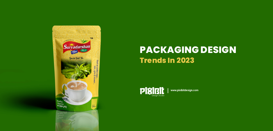
Packaging design trends for 2023 reflect various responses to current events: rising inflation, world wars, and the climate crisis. From cute escapism to nostalgia, the packaging design aesthetic portrays optimism and excitement through very bright colors and playful imagery, while fitting comfortably into familiar surroundings, offering a variety of tastes, but one thing is certain, this packaging design The trend is a fun, bright, and playful mix.
Brands need to be aware of packaging trends for 2023 as shoppers are fast looking for functional and attractive packaging designs. Packaging design is an integral part of the branding strategy of Indian companies.
Since packaging design can influence a customer’s buying decision, the best packaging design will help a brand stand out from the competition.
Mascot variations that tie products together
Traditionally, mascots have remained more or less the same. They wear the same clothes and have consistent personalities. This all changes as brands add variations in the appearance of mascots between product types and flavors, new clothes, actions, or attitudes.
Product visuals with a creative twist
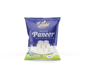
Product visuals are the main content of the packaging design and help to understand the content of the package itself. But in 2023, product visuals relax in presentation through abstraction, geometry, and simple shapes.
The idea here is for the visuals on the packaging to suggest what’s inside, rather than just placing the product on the packaging. Using loose or abstract interpretations of products meets our expectations and promotes our freedom of expression. The result is the creation of new designs for independent products.
Illustrated ingredients in punchy palettes
One of our favorite packaging design trends for 2023 is adorning packaging with bright and fun stylistic ingredients that reflect a greater cultural appreciation for transparency, especially when it comes to what we put out there inside our bodies. Not only will this grab the attention of people who want to know what the product is made of, but it can also differentiate between flavors or variations of a particular product.
The visuals of this trend tend to be cartoonish and youthful, as a way to evoke childhood memories and provide healthy energy. Illustrated composition relies on fresh, juicy colors and less polished artistic styles such as doodles to make the products on the packaging more appealing and fun. Ecstatic colors
Brighter and more vivid colors will attract attention. It’s so simple. This is why color will be trending in packaging design in 2023. Ecstatic colors leave formality aside and are a smart way to make your packaging stand out.
Because ecstasy colors are bold, highly saturated, and feature vivid hues, they create an impression of confidence and fearlessness. But what’s even more rewarding is how fun and even whimsical these colors can be. They can give us a glimmer of hope and joy as we look to the future.
’70s vintage
Retro 70s style never goes out of style, it just hibernates for a few years. In the wake of the pandemic, it’s understandable that warm 70s colors and cozy wavy imagery are shifting from home decor to fashion and even packaging design trends.
Aesthetically, the retro 70s style relies on earthy color palettes, especially shades of brown and orange, lively fonts, and chunky wavy patterns. This design trend evokes an airy familiarity and sassy individualism.
Tactile texture
As brands look for ways to make their packaging stand out, they are discovering the benefits of tactile textures. We are seeing more and more techniques for adding texture to packaging such as embossing and embossing (raised or recessed places on the packaging), die-cutting (creating artistic holes in the packaging), and l foil printing (using reflective metal on the packaging).
Labels and packaging using these printing techniques always increase the perceived value of a product as they look fancy and are often associated with premium brands. As many of our lives go digital, this trend in packaging design is making us tactile. There is also something to be said for the feel of a wrap with a special texture that appeals not only to the eyes but also to the senses.
Wrap-around patterns
Packaging graphics use wide, seamless lines that are pleasing to the eye to spark curiosity and encourage product selection. These visual elements transcend the design of the front of the pack, favoring a desire for freedom and breaking codes.
Use wraparound graphics that cover all sides of the packaging to invite us to pick up and explore the product. It caught our attention, especially when the designs lined the shelves. The appeal of this packaging trend is the consistency with the pattern and the fluidity of the design.
Typographic scrawl
Typography on packaging knows its trends, and the recent resurgence of handwritten or “scribbled” texts is undeniable. Aesthetically, this trend takes us back to a permanent marker base with streaks and uneven color, as if someone had effortlessly written the name of a product on a box or box.
The visuals have a laid-back, personal DIY feel, unlike the more polished and streamlined branding. Instead, these designs are more authentic and appeal to our lighter sides. For many, this kinder response in our time can help us stand firm amid all the chaos.
Cartoon charm
Cartoons have always had a special charm. The cute aesthetic and quirky situations give the manga a fun and fantastical feel reminiscent of childhood. Putting these cartoons on your packaging will not only accentuate the charm but also enhance the brand personality.
In 2023, on-pack comics tend to be classic and simple, similar to newspaper comics. They look like they were drawn quickly and effortlessly by hand. Unlike the more polished cartoons in film and television, the hand-drawn features in these cartoons are a bit wonky and imperfect. It all adds to the overall silliness and goofy charm of the cartoon.
Sticker book aesthetic
Who doesn’t love stickers? The packaging trend of using stickers book aesthetics appeals to our inner child, especially those nostalgic for the 90s.
These designs use bright colors and are often identified by spacing out or even overlapping certain images (especially cute icons or illustration doodles) with other images. This floating composition style replicates a sticker book, where the stickers are often placed haphazardly, giving it a carefree and irreverent energy. Like other nostalgic trends, stickers appeal to a happier, simpler time, adding both fun and an escape from the current state of the world.
Ready for the biggest packaging design trends in 2023?
If there is one thing that can be inferred from the latest trends in packaging design, it is that they are a reaction and a reflection of the times. In the face of all the uncertainty and turmoil of the past year, people are responding to a positive, familiar style in packaging design, whether to escape reality, recall the past, or find hope for the future.
